Choosing the appropriate font and style is essential for making text easy to read on a page.
CSS offers several properties for styling text fonts, such as changing their appearance, controlling their size and thickness, managing variations, and more.
The font properties include: font-family, font-style, font-weight, font-size, and font-variant.
Now, let's explore each of these font properties in detail.
The font-family property allows you to specify which font should be used to display the text.
This property can list several font names separated by commas, creating a fallback system. If the first font isn't available, the browser will attempt to use the next one, and so on.
It's important to list the preferred font first, followed by any alternatives. The list should end with a generic font family, such as serif, sans-serif, monospace, cursive, or fantasy. A typical font family declaration might look like this:
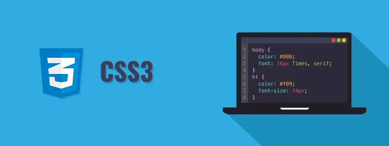
body {
font-family: Arial, Helvetica, sans-serif;
}
Note: Font family names with more than one word must be enclosed in quotation marks, like "Times New Roman", "Courier New", "Segoe UI", etc.
The most commonly used font families in web design are serif and sans-serif, as they are more suitable for reading. Monospace fonts are often used to display code because each letter takes up the same space, resembling typewritten text.
Cursive fonts mimic handwriting, while fantasy fonts offer artistic styles, although they're less widely used due to limited availability across operating systems.
Serif fonts have small lines or strokes at the ends of characters, while sans-serif fonts are straighter and lack these strokes. Refer to the illustration below:

To explore commonly used font combinations, you can refer to the reference on web safe fonts.
The font-style property determines the style of the font face for the text within an element.
Font styles can be normal, italic, or oblique, with normal being the default.
Let's see an example below to understand how it works:
p.normal {
font-style: normal;
}
p.italic {
font-style: italic;
}
p.oblique {
font-style: oblique;
}
Note: Although oblique and italic font styles may appear similar at first glance, there's a difference. The italic style uses an italic version of the font, while the oblique style is simply a slanted or sloped version of the normal font.
The font-size property sets the size of the font for the text within an element.
There are various ways to specify font size values, such as keywords, percentages, pixels, ems, etc.
Using pixel values (e.g., 14px, 16px) for font size is suitable when precise pixel accuracy is needed. Pixels are absolute units of measurement that specify a fixed length.
Let's see an example below to understand how it works:
h1 {
font-size: 24px;
}
p {
font-size: 14px;
}
Defining font sizes in pixels isn't considered very accessible because users can't adjust the font size from browser settings. For inclusivity, it's better to use values relative to the user's default font size instead.
Tip: Text can be resized in all browsers using the zoom feature, but this resizes the entire page, not just the text. The W3C suggests using em or percentage (%) values for robust and more adaptable layouts.
The em unit indicates the font size of the parent element. When defining the font-size property, 1em equals the size of the font applied to the parent element.
For example, if the body element has a font-size of 20px, then 1em = 20px and 2em = 40px.
If no font size is set on the page, it defaults to the browser's default, typically 16px. Thus, 1em = 16px and 2em = 32px.
Let's see an example below to understand how it works:
h1 {
font-size: 2em;    /* 32px/16px=2em */
}
p {
font-size: 0.875em;    /* 14px/16px=0.875em */
}Calculating em values might seem complex. To simplify, you can set the font-size for the body element to 62.5% (equal to 10px, or 0.625em), making it easier to use em units.
Now you can set font sizes for elements using em units by dividing the pixel value by 10. For instance, 10px = 1em, 12px = 1.2em, 14px = 1.4em, 16px = 1.6em, and so forth.
Check out the example below:
body {
font-size: 62.5%;    /* font-size 1em = 10px */
}
p {
font-size: 1.4em;    /* 1.4em = 14px */
}
p span {
font-size: 2em;    /* 2em = 28px */
}CSS3 introduced the rem unit (root em), which is always relative to the font size of the root element (html), regardless of the element's position in the document (unlike em, which is relative to the parent element's font size).
Thus, 1rem equals the font size of the html element, typically 16px by default in most browsers. Let's explore an example below:
html {
font-size: 62.5%;    /* font-size 1em = 10px */
}
p {
font-size: 1.4rem;    /* 1.4rem = 14px */
}
p span {
font-size: 2rem;    /* 2rem = 20px (not 28px) */
}
CSS provides keywords to define font sizes.
Absolute font size can be specified using keywords like xx-small, x-small, small, medium, large, x-large, xx-large. Relative font size can be set using smaller or larger. Check out the example below:
body {
font-size: large;
}
h1 {
font-size: larger;
}
p {
font-size: smaller;
}
Note: The keyword medium equals the default font size in browsers, typically 16px. Similarly, xx-small equals 9 pixels, x-small equals 10 pixels, small equals 13 pixels, large equals 18 pixels, x-large equals 24 pixels, and xx-large equals 32 pixels.
Tip: By setting a font size on the body element, you can establish relative font sizing throughout the page, allowing for easy scaling of font size up or down as needed.
Font sizes can also be specified using viewport units such as vw or vh.
Viewport units refer to a percentage of the browser's viewport dimensions, where 1vw equals 1% of the viewport width, and 1vh equals 1% of the viewport height. Therefore, if the viewport is 1600px wide, 1vw is 16px.
Experiment with the following example by resizing the browser window:
body {
font-size: 1vw;
}
h1 {
font-size: 3vw;
}
Viewport units pose a challenge on small screens, where fonts may become too small to read. To mitigate this, you can use the CSS calc() function:
html {
font-size: calc(1em + 1vw);
}
h1 {
font-size: 3rem;
}
In this example, even if the viewport width is 0, the font size will be at least 1em or 16px.
You can further utilize CSS media queries to create more responsive and fluid typography.
The font-weight property specifies the weight or boldness of a font.
This property accepts values such as normal, bold, bolder, lighter, 100, 200, 300, 400, 500, 600, 700, 800, 900, and inherit.
100 to 900 specify font weights, where each number represents a weight greater than its predecessor. For example, 400 is equivalent to normal, and 700 is equivalent to bold.bolder and lighter are relative to the inherited font weight, while normal and bold are absolute font weights.Check out the following example to see how this property works:
p {
font-weight: bold;
}
Note: Many fonts offer only a limited number of weights, often just normal and bold. If a font does not have the specified weight, the browser will choose the closest available weight.
The font-variant property allows text to be displayed in a special small-caps variation.
Small-caps, or small capital letters, differ slightly from normal capital letters. Lowercase letters are displayed as smaller versions of the corresponding uppercase letters.
Check out the following example to see how this property works:
p {
font-variant: small-caps;
}
The value normal removes small caps from text that's already formatted that way.